
Creating a Color Scheme: Why Your Brand’s Palette Matters More Than You Think
Let’s talk about color schemes. You might think that choosing colors for your brand is a minor detail, something you can just slap together and call it a day. If that’s your mindset, you’re in for a rude awakening. Your color scheme isn’t just a cosmetic choice—it’s a critical part of your brand’s identity and can make or break your marketing efforts.
Here’s the deal: a poorly chosen color scheme can undermine your brand’s credibility and make you look unprofessional. Meanwhile, a well-thought-out palette can convey your brand’s personality, evoke the right emotions, and make you memorable. So, if you’re just picking colors because they “look nice,” you’re doing it wrong.
Why Most Color Schemes Are a Disaster
Many businesses choose their color schemes based on trends or personal preferences, without considering how the colors will affect their brand perception. The result? A mishmash of colors that do nothing to enhance their brand’s message or appeal to their target audience.
Example of Failure
Gap rebranded its logo in 2010 with a new, simplistic design that included a blue box around the word “GAP.” The color scheme and design felt detached from their established brand identity, which traditionally used a classic blue palette. The backlash was so severe that Gap reverted to their old logo within a week. This fiasco illustrates how poorly chosen colors can alienate your audience and damage brand equity.
What Makes a Good Color Scheme
A successful color scheme does more than just look good. It should be strategically chosen to reinforce your brand’s message and appeal to your target audience.
Examples of Success

Chanel is a prime example of a luxury brand with a color scheme that works flawlessly. The combination of black and white in Chanel’s branding conveys sophistication, elegance, and timelessness. This color scheme is not only instantly recognizable but also reinforces the brand’s position as a high-end fashion icon. The consistent use of these colors across their products, packaging, and marketing materials creates a cohesive and powerful brand image.
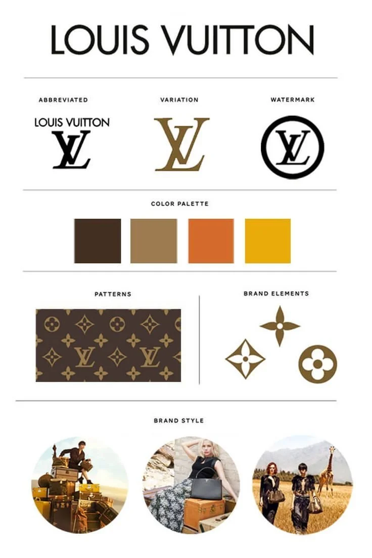
Louis Vuitton uses a rich color palette that includes the iconic brown and gold. The deep brown represents luxury and durability, while the gold accents add a touch of opulence. This color scheme is integrated seamlessly into their products and marketing, reinforcing their reputation for high-quality, luxury fashion.
Let’s break it down
Understand Color Psychology: Colors evoke emotions and associations. For example, gold is often associated with luxury and exclusivity, while black can signify sophistication and elegance. Choose colors that align with the emotions you want to evoke in your audience.
Consistency is Key: Use your color scheme consistently across all branding materials to create a cohesive and recognizable brand image.
Consider Accessibility:** Ensure that your color choices are accessible to everyone, including those with color blindness. High contrast and readable color combinations are essential.
Why Playing It Safe Will Ruin Your Brand
Choosing a color scheme based solely on what’s trendy or safe can lead to a lackluster brand identity. Playing it safe means blending in rather than standing out. If you’re not willing to invest time and thought into your color choices, your brand will likely fade into the background.
Tips for Creating an Effective Color Scheme:
Do Your Research: Understand the emotional and psychological impacts of different colors and choose ones that align with your brand’s message.
Test and Iterate: Don’t just pick colors and run with them. Test how they look in different contexts and make adjustments as needed.
Create a Style Guide: Document your color palette and how it should be used in various applications to maintain consistency.
Seek Professional Help: If you’re unsure about your choices, don’t hesitate to consult a branding expert or designer. Their expertise can ensure your color scheme works effectively for your brand.
Why My Brand Colors Work: A Personal Touch
Let’s wrap this up with a personal example. My own brand colors are a reflection of my bold personality and roots in Pittsburgh. I’ve chosen a palette that represents my past and pays homage to my family, who have instilled in me a strong work ethic. Despite my preference for shades and a general aversion to color, I use a striking pop of yellow/gold in my branding. This vibrant hue cuts through the monotony and demands attention, embodying my commitment to making a memorable impact. It’s not just about looking good—it’s about standing out and telling my story.
So, if you’re ready to give your brand a standout color scheme that reflects its true identity, I’m here to help. With experience in branding and design, I can craft a color palette that not only looks great but also reinforces your brand’s message and connects with your audience. Let’s make sure your brand’s colors shine in all the right ways while you focus on running your business.